In Dubai, bilingual design isn't optional - it's expected. Arabic is the official language, but with an expat-majority population, English is essential. The challenge is creating designs where both languages feel equally important, not like one is an afterthought.
I've seen too many designs where the Arabic text is clearly added last, crammed into corners, or worse - mistranslated or displayed incorrectly. Here's how to do bilingual design properly.
Understanding Arabic Script
Key Differences from English
- Direction: Arabic reads right-to-left (RTL)
- Connected script: Letters connect to each other
- No capitals: No uppercase/lowercase distinction
- Diacritics: Marks above/below letters (often optional in print)
- Vertical rhythm: Different than Latin scripts
Common Technical Errors
- Letters displaying disconnected (not joining)
- Text displaying left-to-right instead of right-to-left
- Letters in wrong order or reversed
- Wrong font substitution
Cause: Usually software or font issues. Always test with native speaker.
Layout Approaches
Side-by-Side
Languages placed next to each other - Arabic on right, English on left.
Best for: Brochures, menus, forms, signage
Pros: Equal prominence, easy comparison
Cons: Needs more horizontal space
Stacked
One language above the other. Typically Arabic above English.
Best for: Posters, business cards, narrow formats
Pros: Works in any width
Cons: One language inevitably looks secondary
Flip Book
Arabic on one side/half, English on the other. Often used for booklets.
Best for: Brochures, catalogs, instruction manuals
Pros: Full attention to each language
Cons: Readers need to flip/turn
Mirror Layout
Same design, mirrored for each language. Arabic version is RTL mirror of English.
Best for: Websites, apps, multi-page documents
Pros: Authentic experience in each language
Cons: More design work
Typography Guidelines
Font Selection
- Choose fonts designed for Arabic, not Latin fonts with Arabic support added
- Match visual weight between Arabic and English fonts
- Consider readability at all sizes
- Test extensively before printing
Recommended Arabic Fonts
Size Considerations
- Arabic text often needs to be slightly larger than English for equal readability
- Line height requirements differ - Arabic may need more vertical space
- Test at actual print size, not on screen
Translation Quality
Poor translation undermines even the best design.
Do
- Use professional translators
- Have native speakers review
- Provide context for translators
- Consider cultural nuances
- Test with target audience
Don't
- Use Google Translate for final copy
- Assume direct translation works
- Skip proofreading
- Ignore dialect differences
- Rush the translation process
Application-Specific Tips
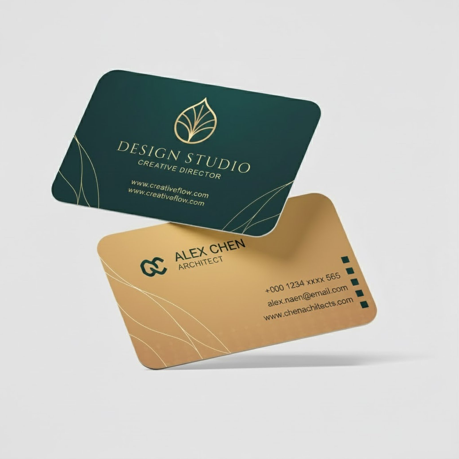
Business Cards
- Often printed double-sided: English one side, Arabic other
- Alternative: horizontal split with Arabic right, English left
- Name transliteration needs care (how to spell English names in Arabic)
Menus
- Side-by-side layout works well
- Prices only need to appear once
- Food names may not translate - consider transliteration or description
Signage
- Arabic typically above English in stacked layouts
- Legal requirements may specify minimum Arabic text size
- Test readability from intended viewing distance
Brochures
- Flip book format popular - Arabic opens from right, English from left
- Consider which audience is primary
- Maintain design consistency across both versions
Legal Requirements
Some materials require Arabic by law in the UAE:
- Product packaging (consumer goods)
- Official documents and contracts
- Public signage in many contexts
- Safety information
- Menus (Dubai Municipality requirement)
Check specific requirements for your industry and material type.
Design Workflow
- Design in both languages simultaneously - Don't finish English then add Arabic
- Get content translated early - Arabic text length affects layout
- Build flexible layouts - Arabic text is often 20-30% longer than English
- Review with native speakers - Both languages, before final
- Print proofs in both languages - Check rendering issues
Common Mistakes to Avoid
- Arabic as afterthought - Clearly squeezed in after English design was finalized
- Wrong text direction - Arabic displaying left-to-right
- Disconnected letters - Letters not joining properly
- Mixing fonts - Arabic and English fonts that don't match
- Ignoring white space - Cramming Arabic into tight spaces
- Translation errors - Embarrassing or confusing mistakes
- Different visual importance - One language clearly primary
Testing Checklist
- ? Arabic text displays right-to-left
- ? Letters connect properly
- ? No reversed or jumbled text
- ? Translations reviewed by native speaker
- ? Visual balance between languages
- ? Both languages readable at print size
- ? Fonts render correctly in print
- ? Layout works when text length varies
Ready to get started?
Look, we've been in this business long enough to know what works and what doesn't. If you're not sure where to begin, just give us a call. No pressure, no sales pitch - we'll walk you through the options and give you an honest quote.
What you get with us:
- Straight answers about what you actually need (not what costs the most)
- Fair pricing - we'll tell you how to save money where it makes sense
- Quick turnaround when you need it, or save by planning ahead
Need Bilingual Design?
We design Arabic-English materials with proper typography and layout. Native speaker review included.
Get Your Quote+971 56 978 6395