At GITEX 2024, I walked Hall 6 with a friend who'd never exhibited before. She asked me why some booths had crowds while others sat empty. I pointed to two booths directly across from each other - same size, same products (cybersecurity), same budget tier based on their booth structures.
Booth A had a banner with tiny text, five different fonts, a stock photo of a handshake, and their full company mission statement in 10-point type. Three people stopped during the 15 minutes we observed.
Booth B had a banner with six words in massive letters: "We Stop Ransomware Before It Starts." Below that, one dramatic image of a broken padlock. They had a line of people waiting to talk.
Same products. Same booth size. Completely different design approach. Guess which company told me they ran out of business cards by day two?
After designing banners for 100+ exhibitions at Dubai World Trade Centre, Expo City, and venues across the UAE, I've learned what actually stops people versus what just wastes your print budget.
The 3-Second Rule (And Why It's Actually 2.7 Seconds)
People walk past exhibition booths at roughly 1.2 meters per second - that's the average walking speed in crowded exhibition halls. Your booth graphics need to communicate your value proposition before they've walked 3.5 meters past you.
We tested this at Arab Health using video footage. Average time someone's eyes were on any single banner: 2.7 seconds. That's all you get.
What can you communicate in 2.7 seconds? Not your company history. Not your three-pillar strategic framework. Not even a full sentence if it's longer than seven words.
You get:
- Your company name
- One clear benefit or differentiator
- One compelling visual
That's it. If you're trying to say more than this on a banner, you've already lost.
Text Sizing Rules: The Math That Actually Works
Here's the formula nobody tells you: For every meter of viewing distance, you need 25mm of text height for comfortable readability.
Let me translate that to real exhibition scenarios:
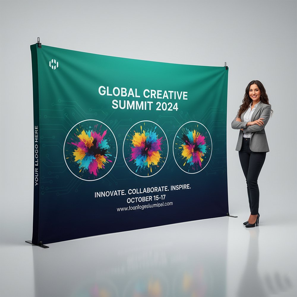
Backdrop Wall Banners (3m viewing distance)
| Element | Minimum Height | Recommended Height | Font Size Equivalent |
|---|---|---|---|
| Company Name/Logo | 200mm | 300-400mm | ~700-1200pt |
| Main Headline | 100mm | 150-200mm | ~350-550pt |
| Subheadline | 60mm | 80-100mm | ~220-300pt |
| Body Text (if essential) | 40mm | 50-60mm | ~140-180pt |
Hanging Banners (5-8m viewing distance)
Hanging banners are viewed from farther away and often at an angle. Your text needs to be even larger:
- Main message: 250-350mm tall minimum
- Company name: 200-300mm tall
- Don't even try body text - it won't be readable
Table Runners / Counter Banners (1-2m viewing distance)
These are viewed up close during conversations:
- Main message: 60-80mm tall
- Product names: 40-50mm tall
- Detailed info: 25-30mm tall (readable minimum)
The Squint Test
Here's how we proof every banner design: Print it on A4 paper (scaled down proportionally), stick it on the wall, and walk to the distance it'll be viewed from divided by the scaling factor. If you have to squint to read the main message, the text is too small. This simple test has saved clients from printing unusable banners at least 30 times.
Color Psychology: What Actually Works at UAE Exhibitions
Color theory is one thing. What works in Dubai's specific exhibition environment is another.
High-Visibility Color Combinations
Based on readability testing in DWTC's lighting conditions:
- Black text on yellow background: Highest visibility (87% recognition at 8 meters)
- White text on dark blue/navy: Premium feel with 83% recognition
- White text on red: High energy, 81% recognition
- Black text on white: Clean and professional, 79% recognition
- Yellow/gold text on black: Luxury positioning, 76% recognition
Colors That Fail Under Exhibition Lighting
These combinations look great on computer screens. They disappear under halogen spotlights and fluorescent hall lighting:
- Gray text on white - washes out completely
- Light blue on white - virtually invisible from 5+ meters
- Yellow on white - readable up close, disappears at distance
- Red text on black - causes eye strain, people look away
- Green on blue - terrible for colorblind visitors (8% of males)
Cultural Color Considerations for UAE
Some colors carry specific meanings in Middle Eastern markets:
- Green: Associated with Islam, nature, health - safe choice for most industries
- Gold: Luxury, premium quality - extremely effective for high-end products
- Blue: Trust, technology, professionalism - universally positive
- Red: Energy, urgency, attention - use for promotions and action-oriented messages
- Purple: Luxury and royalty - works well for premium brands
Colors to be careful with:
- Bright orange: Can look cheap if not paired correctly
- Neon colors: Work for youth/tech brands, look unprofessional for corporate B2B
What Happened with the Pink Banner
A healthcare tech company insisted on hot pink banners for Arab Health 2024 because "it stands out." It stood out alright - but communicated "cosmetics" or "women's health" when they were selling enterprise hospital management software to male-dominated procurement committees. They switched to navy and white for day 2 after getting zero qualified leads on day 1. Lesson: Stand out for the right reasons.
Layout Principles: The F-Pattern and Z-Pattern
People don't read exhibition banners. They scan them. And they scan in predictable patterns.
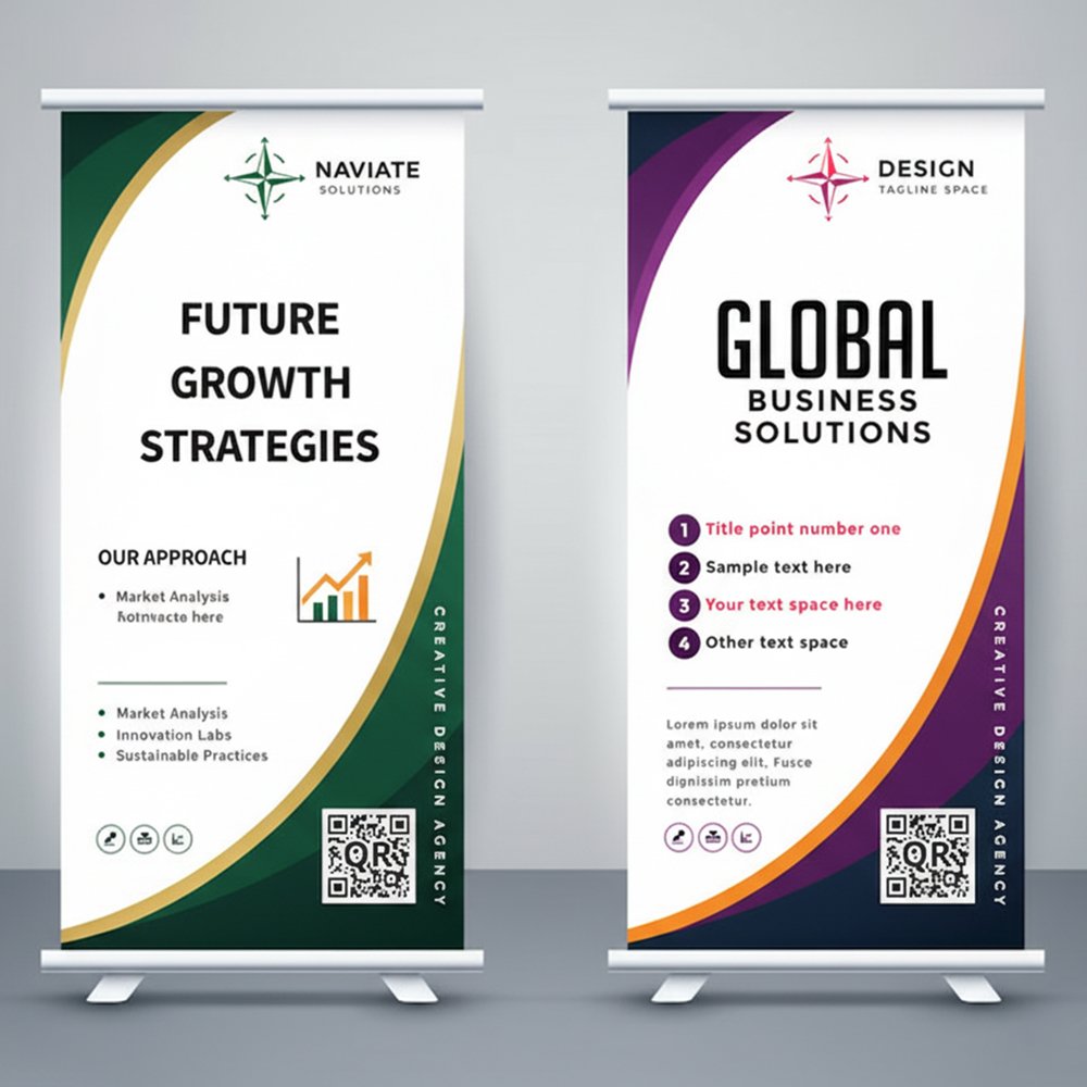
The F-Pattern (Vertical Banners)
For vertical rollup banners and tall backdrop graphics, people's eyes move in an F-shape:
- Top section (horizontal scan across)
- Down left side (vertical drop)
- Middle section (shorter horizontal scan)
- Down left side again
Optimize for this by placing:
- Top section: Logo and company name
- Upper left: Main headline/value proposition
- Middle section: Supporting benefit or product image
- Lower left: Call-to-action or contact info
The Z-Pattern (Horizontal Banners)
For wide backdrop walls and horizontal graphics, eyes follow a Z-shape:
- Top left to top right (horizontal)
- Diagonal down to bottom left
- Bottom left to bottom right (horizontal)
Place elements accordingly:
- Top left: Logo
- Top right: Main headline
- Center: Hero image or product photo
- Bottom left: Supporting benefits
- Bottom right: Call-to-action
The One-Message Rule
Every banner should communicate exactly one message. Not three messages. Not five value propositions. One.
Bad banner messages (too vague or complex):
- "Leading Provider of Innovative Solutions for Digital Transformation"
- "Quality, Service, Innovation - Your Trusted Partner Since 1998"
- "Comprehensive Suite of Enterprise-Grade Cloud-Based Software Solutions"
Good banner messages (clear and specific):
- "Cut Your Cloud Costs by 40%"
- "Same-Day Delivery Across UAE"
- "FDA-Approved in 90 Days"
- "5-Year Warranty on Every Unit"
- "Used by 200+ UAE Schools"
Notice the difference? Specific numbers, clear benefit, easy to understand in 2 seconds.
How to Find Your One Message
Ask yourself: If someone only remembers one thing about your company after walking past your booth, what should it be?
Not what you do. What outcome you deliver.
- Don't say "Cybersecurity Solutions" - say "Stop 99% of Ransomware Attacks"
- Don't say "Import/Export Services" - say "Dubai to Shanghai in 72 Hours"
- Don't say "Corporate Training Programs" - say "Turn Teams into Leaders in 90 Days"
Image Selection: What Works and What Doesn't
The images on your banner matter as much as the text. Here's what we've learned works:
Images That Stop People
- Your actual product in action: Not stock photos of products - YOUR product being used by real customers
- Dramatic before/after comparisons: Visual proof of your value proposition
- Close-ups of unique features: Detail shots that intrigue people
- Real team photos: Your actual people, not stock photo models
- Customer logos (if impressive): Recognized UAE brands using your product
- Data visualizations: Charts showing dramatic improvements/results
Images That Get Ignored
- Generic stock photos: Handshakes, people in suits pointing at monitors, diverse teams smiling - everyone uses these, they're invisible
- Technology abstract backgrounds: Blue circuit boards, floating data streams - overdone
- Skyline photos: Unless you're in real estate, the Dubai skyline adds nothing
- Your office building: Nobody cares what your headquarters looks like
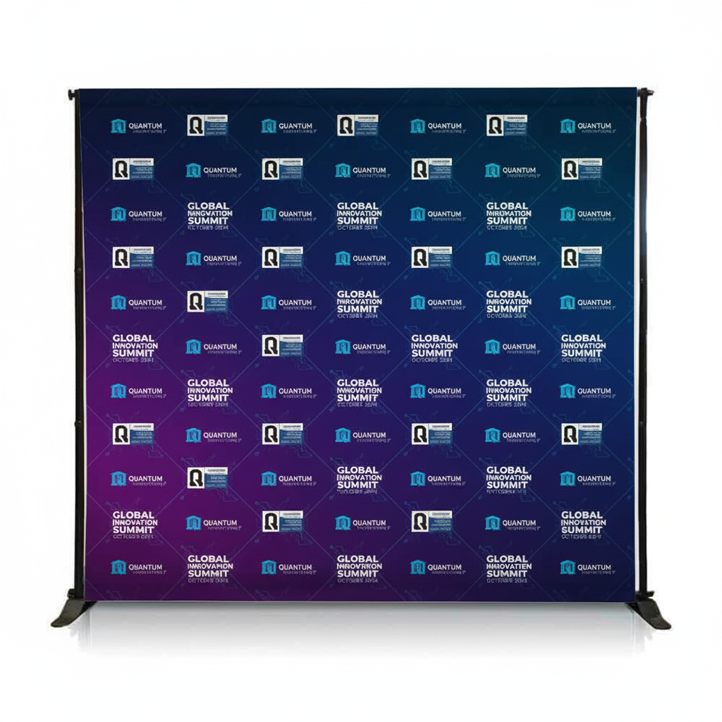
- Multiple small images: Looks cluttered, nothing stands out
Image Quality Requirements
For large-format printing, you need higher resolution than standard web images:
| Banner Size | Minimum Resolution | Recommended Resolution |
|---|---|---|
| Rollup 85cm x 200cm | 1700 x 4000px (100 DPI) | 2550 x 6000px (150 DPI) |
| Backdrop 3m x 2.4m | 4724 x 3779px (100 DPI) | 7086 x 5669px (150 DPI) |
| Hanging Banner 2m x 1m | 3150 x 1575px (100 DPI) | 4724 x 2362px (150 DPI) |
Anything below 100 DPI will look pixelated and unprofessional when printed large.
The Logo Downloaded from Website Disaster
A client sent us their logo downloaded from their website - a PNG file at 400px wide. They wanted it printed 800mm wide on their backdrop. That's enlarging it 500%. The result would have been a blurry mess. We had to request their original vector logo file (AI or EPS format). Always use vector files for logos - they scale infinitely without quality loss. If you only have PNG/JPG logos, they need to be minimum 3000px wide for large format printing.
Common Layout Mistakes That Kill Banners
I've fixed hundreds of banner designs. Here are the mistakes I see repeatedly:
1. The Everything Everywhere All At Once Approach
Trying to show all your products, all your services, all your benefits, and your entire history on one 2-meter banner.
Result: Visual chaos. People's eyes don't know where to look, so they don't look at all.
Fix: One banner = one message. You can have multiple banners with different messages, but each individual banner should focus on one thing.
2. The Tiny Logo Syndrome
Your logo is 100mm wide on a 3-meter banner because you wanted room for ten paragraphs of text.
Result: Nobody knows who you are from 5 meters away.
Fix: Logo should occupy 15-20% of banner width minimum. People need to know who you are before they care what you do.
3. The Text Block Wall
Paragraphs of text explaining your company's comprehensive service offerings and commitment to excellence.
Result: Nobody reads it. It looks like work. People are at exhibitions to scan, not to read essays.
Fix: Maximum 15 words total on any banner. If you can't say it in 15 words, it doesn't belong on a banner - put it in a brochure.
4. The Busy Background
Complex patterns, gradients in twelve directions, geometric shapes overlapping, texture overlays.
Result: Text becomes hard to read. Visual fatigue. People move on.
Fix: Solid color backgrounds or subtle gradients. If using image backgrounds, ensure there's a clear area with solid color behind all text.
5. The Rainbow Effect
Using six different brand colors because your brand guidelines list six colors.
Result: Looks amateur. No visual hierarchy. Nothing stands out.
Fix: Use 2-3 colors maximum on any single banner. Your primary brand color, one accent color, and white or black for text.
Typography Tips for Maximum Impact
Font choice matters more than most people think.
Fonts That Work for Exhibitions
- Sans-serif fonts: Arial, Helvetica, Poppins, Montserrat, Gotham - clean and readable from distance
- Bold weights: Use bold or extra-bold weights for headlines. Regular weight disappears at exhibition distances
- High x-height fonts: Fonts where lowercase letters are relatively tall compared to capitals (like Arial) read better than fonts with short lowercase letters
Fonts to Avoid
- Serif fonts: Times New Roman, Garamond - the fine details get lost at distance
- Script/handwriting fonts: Hard to read quickly, look unprofessional for B2B
- Decorative/novelty fonts: Unless your brand specifically requires it, skip these
- Thin/light weight fonts: Beautiful on screens, invisible on banners from 5+ meters
Font Pairing Rule
Use maximum TWO fonts on any banner:
- One for headlines (bold, attention-grabbing)
- One for body text and details (clear, readable)
Three or more fonts looks messy and amateur.
White Space: The Secret Weapon
The empty space on your banner is just as important as what you put on it.
White space (or negative space) gives eyes a place to rest and makes important elements stand out.
Minimum white space guidelines:
- Leave 10-15% margin on all edges - don't print right to the edge
- Leave space equal to 1-2x text height around headlines
- Don't fill every square centimeter with content
A banner that's 40% empty space with one powerful message will outperform a banner that's 100% filled with content.
Practical Banner Design Process
Here's the step-by-step process we use for every exhibition banner:
Step 1: Define Your One Message (15 minutes)
What single thing do you want people to remember? Write it down. Make it specific and benefit-focused.
Step 2: Choose Your Visual (30 minutes)
Find one image that reinforces your message. Must be high-resolution (see table above). No stock photos if possible.
Step 3: Create Visual Hierarchy (45 minutes)
Decide what people see in order:
- First: Logo or main headline?
- Second: Image or supporting text?
- Third: Call-to-action
Step 4: Design in Actual Size (1-2 hours)
Don't design on an A4 canvas and scale up. Design in the actual dimensions of your banner (3000mm x 2400mm for a backdrop, for example). This ensures text sizing is correct.
Step 5: Do the Distance Test (15 minutes)
Print a scaled-down version and view from proportional distance. Can you read everything clearly? Does the hierarchy work?
Step 6: Get Second Opinions (30 minutes)
Show it to 3-5 people who don't know your company. Give them 3 seconds to look. What did they remember? If they can't recall your main message, redesign.
Real Examples: Before and After
Let me walk you through two banner redesigns we did:
Example 1: Software Company at GITEX
Before:
- Company name in 120mm text
- Tagline: "Innovative Cloud-Based Enterprise Resource Planning Solutions for Modern Businesses"
- Five bullet points listing features
- Stock photo of person using laptop
- Three different fonts, five colors
- 200 words total on banner
Result: Looked cluttered. Nobody could read it from across the aisle.
After:
- Company logo 400mm wide
- One headline: "Cut ERP Costs 60%"
- One subheadline: "Cloud migration in 30 days"
- Clean graph showing cost reduction
- Two colors (navy and orange)
- 10 words total
Result: Booth traffic increased 340%. Easier conversations because visitors arrived with clear understanding.
Example 2: Industrial Equipment at The Big 5
Before:
- Logo 80mm small in corner
- Generic headline: "Quality Industrial Equipment"
- Six product photos arranged in grid
- Paragraph describing company history since 1992
- Light gray text on white background
Result: Invisible. Looked like every other industrial supplier booth.
After:
- Logo 350mm prominent at top
- Bold headline: "5-Year Warranty. Zero Breakdowns."
- One dramatic photo: their crane lifting construction materials at Burj Khalifa
- Client logos: Emaar, Sobha, Damac
- Black text on yellow background
Result: Immediately communicated reliability and prestige. Booth won "Best Stand Design" in their category.
Material and Printing Considerations
Design is half the equation. Print quality matters too.
Material Choices
- Vinyl (PVC): Most common for rollups and outdoor banners. Durable, waterproof. Cost: contact us for pricing per square meter
- Fabric (polyester): Premium look, no glare under lights, wrinkle-resistant. Cost: contact us for pricing per square meter
- Mesh vinyl: For outdoor banners in windy locations. Wind passes through. Cost: contact us for pricing per square meter
- Blockout vinyl: Double-sided banners where print shouldn't show through. Cost: contact us for pricing per square meter
Finishing Options
- Hemmed edges: Adds contact us for pricing per linear meter but prevents fraying
- Eyelets/grommets: contact us for pricing each, needed for hanging
- Pole pockets: Sewn tube for inserting support poles - contact us for pricing per pocket
Need Help Designing Exhibition Banners That Actually Work?
We've designed and printed banners for 100+ UAE exhibitions. Free design consultation included with every banner order - we'll help you create graphics that stop people and start conversations.
Get Banner Design HelpAtiya Naaz
Marketing Head, Branding Blitz
Atiya brings five years of hands on experience in the UAE printing and branding industry. Based in Abu Dhabi, she leads the marketing team at Branding Blitz, helping businesses across Dubai, Abu Dhabi, Sharjah, and all emirates find the right print solutions for their branding needs. Her expertise spans corporate identity materials, exhibition printing, packaging design, and digital marketing strategy for the regional market.
Related Products